

Massive thank you to the excellent Homes & Antiques magazine for featuring us in their Christmas issue. On sale now.
December 08, 2014
Massive thank you to the excellent Homes & Antiques magazine for featuring us in their Christmas issue. On sale now.
July 24, 2014

I've just started blogging for Homes & Antiques Magazine. The first post is on Chinese garden stools.
Here's the link: The Charm of Chinese Garden Stools.
There are no comments.
April 27, 2014

We're almost there with our stand at the Battersea Decorative Antiques Fair, which opens this Tuesday (29th April, 2014). It's taken three days of hard work to get this far (up at four in the morning yesterday, to sort out stock and load stuff for delivery). But it's been worth it. We've re-created a Gentleman's Retreat. The Victorian Rectory Meets The English Castle Library Look.
It's all slightly bonkers, but it's been enormous fun. I'm examining a delightful bakelite kidney section, while my trusty assistant, Miss Caroline Watson, reads a John Buchan thriller. Look forward to seeing you there. Cocktails and Canapés on Tuesday evening. Stand 59.
There are no comments.
April 03, 2014
"Welcome to the wonderful world of Mah Jong, an ancient and mysterious game, played for many thousands of years, its origins hidden by the mists of time…"
Don't believe a word of it. Mah Jong (in its modern form) was actually the creation of Joseph Park Babcock (1893-1949), an executive of the Standard Oil Company. In 1912 Babcock was sent to Soochow, China, where he learnt to play a version of a Chinese tile game. Inspired by this, he created a new, simplified game, took out a trade-mark "Mah-Jongg", and exported it back home to America.
The first Mah Jong sets were sold at Abercrombie & Fitch in 1920. The game took off and soon became a massive craze across America, Britain and Europe. In a sense, Babcock was lucky- his new game co-incided with the craze for Chinoiserie (a Western interpretation of all things Oriental) which flourished in the years after the First World War. Have a look at the extraordinary Grauman's Chinese Theatre, built in 1926 on Hollywood Boulevard:

Mah Jong was especially popular with fashionable young women. Here are three bathing beauties playing Mah Jong on Venice Beach, California in 1924:

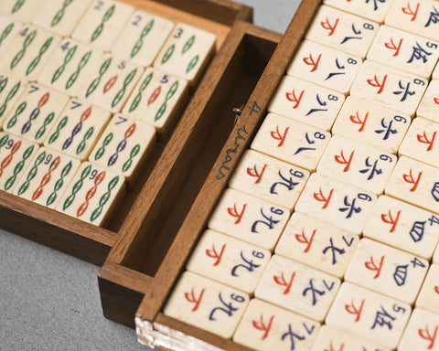
But if you're interested in buying a vintage Mah Jong set, where to start? First, don't believe anybody who tries to sell you a 19th century Mah Jong set. The genuinely old sets will date to the 1920's and are most likely to have been made in Shanghai for export to the West. With the huge popularity of the game, many new Mah Jong factories were set up in the environs of Shanghai (then an international city more-or-less under control of the Western Powers), and local children were employed to paint the tiles.
Secondly, don't believe anybody who tries to tell you that the tiles are made from ivory. They're not. 99% of Mah Jong tiles are made from either cow bone or 'ivorine' (an early form of plastic) which is then mounted on bamboo. I have never (yet) seen an ivory mahjong set. Jade, yes. But not ivory. The American Mid-West exported huge quantities of cow-bone to China, which was used in the manufacture of Mah Jong sets and then re-exported back to the United States. That Mah Jong tile you're holding in your hand travelled half-way across the world and back again.
So you now want a genuine 1920's mah jong set with bone and bamboo tiles. Which to go for? As an antique dealer, I'm more interested in the finer sets with nicely carved boxes, often featuring dragons, plants and Chinese characters. Box sets with the sliding front panels tend to be better quality. Here's a stylish Mah Jong set I sold to a lucky client last year:
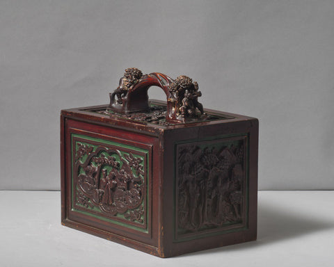
I've posted a close-up of another good example at the top of the page. Here's a further shot of it, below. It's currently in stock, so if you're interested in buying it please get in touch. You can read all about it here.

There are no comments.
January 16, 2014

Or "American Ice-Cream Parlor" chairs, to be more accurate. Ice-Cream parlours and Soda Fountains were very much part of the American Way of Life. During the 19th century attempts were made to replicate- and bottle- the natural mineral waters found at fashionable spas. Coca-Cola is a good example. Originally invented by John Pemberton as a patent medicine cure, it was subsequently rebranded as a enjoyable drink in its own right. Coca-Cola was good for you! Soda Fountains became popular in chemists, pharmacies and ice-cream parlours throughout the United States, and especially so when, with Prohibition, the sale of alcohol was banned in 1919.
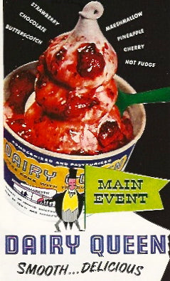
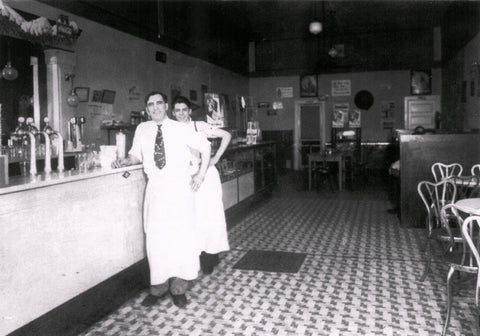
Have a look at the rather blurry photograph below of an American Ice-Cream parlour, which, I think, dates to about 1910. The chairs are similar to the rather stylish chairs we bought recently from a shop in the Lillie Road, and which I've just photographed in our tiny, rain-drenched, grey-skied London Garden (above). These are often referred to as "Ice-Cream" chairs, and I can see why. I think, however, it much more likely that our examples are French café chairs from the 1950's or 60's. They evoke fantasies of Paris in the Spring. I'm going to re-paint them an off-white (I'm keen to avoid the F & B sludge green at all costs), but one half of me actually rather likes they way they are rusting elegantly away.

The photograph of the soda fountain below, dates from the 1920's:
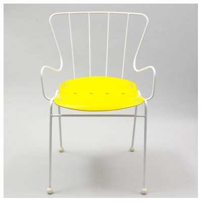
On a similar theme is the Antelope Chair, designed by Ernest Race for the Festival of Britain café in 1951. Until recently, the V & A were selling a reproduction, with a vivid yellow seat (below). An example can be seen at the Frederick Parker Chair Collection in the East End of London.
Peak of Chic. It’s very 50’s in feel isn’t it? Colour of garden furniture is an interesting point- here in England F & B grey/green is very popular and has been done to death- every gastropub in the land is painted in that colour. I like the idea of a return to white. Grey/White rather than Cream, I think.
What a jaunty-looking chair. It reminds me of the good old days. I think that you’re spot on about the color- it needs to be off-white.
November 22, 2013
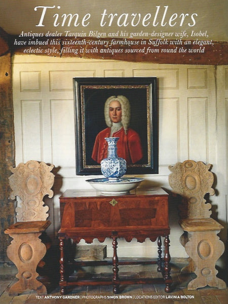
This is a great article, and adds weight to the view that Antiques, and classic British Interiors are definitely back in fashion. Well done to you and Tarquin for spreading the word!
The chairs are almost certainly Italian and if you read the article you may find a familiar name mentioned…
October 14, 2013

Before we carry on with Strawberry Hill, I wanted to give The Great Diary Project a quick mention. This noble cause has just been set up by my old chum, the splendid Dr Irving Finkel, archaeologist, crytopgrapher, ancient board game expert, assistant keeper at the Department of the Middle East at the British Museum and All Round Good Egg. The Great Diary Project has been set up to provide a permanent home for unwanted diaries of any date or kind. If you're concerned about Great Aunt Dot's secrets becoming public knowledge, you can hand over diaries with a proviso that any information in them won't become public knowledge for however long you want.
Irving's been into old diaries for years, rescuing them when he sees them languishing on some stall somewhere, forlorn. As he so rightly says, diaries are a wonderfully rich historical source for furture generations, telling us so much about ordinary people's lives. Often poignant and moving, personal diaries are a different thing from the published diaries of say, well-known politicians or theatre directors. They tell the truth.
And now, with the sinister Kindle and all its Works amongst us, the battle to preserve everyday diaries as historical documents has become even more important than ever.
If you've got time, please do listen to this touching radio documentary. Marvellous stuff.
There are no comments.
October 03, 2013

Rummaging around on the internet, I came across an old friend: The Strawberry Hill Chair, in the collection of the Victoria & Albert Museum, London. I am sure you know all about Strawberry Hill, the extraordinary Gothick house sited on the banks of the River Thames, near Twickenham, to the West of London. Originally a cottage (or small-ish villa) it was re-built by Horace Walpole (the son of the Prime Minister, Robert) at various stages during the eighteenth century: reimagined as a Gothick fantasy in the manner of an abbey, monastary or castle, or at least how, in the 18th century, they thought one should look like. It has recently re-opened to the general public, and if you have the time and inclination, I urge you to go. I love the place.

Horace Walpole was a connoisseur of the exotic, a dilattante, collector, antiquarian and aesthete; an admirer of Medieval architecture. Strawberry Hill has a playful atmosphere: this is a house intended for fun and frolics; an antiquarian fantasy, a make-believe haunted abbey of the imagination, an amusing weekend pastiche for Horace and his friends- away from the hubbub and bustle of London. I have no doubt that in his own mind, Horace was building his own "Castle of Otranto".

The Castle of Otranto was first published in 1764, considered by critics to be the first "Gothic Novel". This strange melodrama, if I remember correctly, features an ancient Italian fortress and a giant ghost helmet which crushes the hero to death in the first chapter. Horace claimed to have discovered the manuscript in the library of "an ancient Catholic family in the North of England". The truth was, of course, that he wrote it himself.
By the mid 18th century, a preference for "All Things Spooky" had become very much the rage, with fashionable society obsessed with macabre yarns involving werewolves, vampyres, lonely hermits, lavicious monks, and all manner of creepy crawlies, nasties, long legg-ed beasties and things that go bump in the night. Gothic Fiction has never really gone out of fashion (think of the success of Bram Stoker's Dracula or Mary Shelley's Frankenstein, both re-invented by Universal Studios in the 1930's) but the Gothick craze had reached such a height that by 1798, Jane Austen was able to lampoon the genre in her amusing- and very readable- satire, Northanger Abbey.

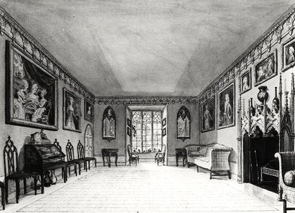
The chair itself was designed in 1755 by Richard Bentley (a member of a sort of 'taste committee' that Horace had set-up to oversee the redevelopment of Strawberry Hill) and made by the trendy London cabinet maker, William Hallett. The back of the chair was inspired by the window of a Gothic church, and the chair was made from beechwood (a cheap, light-weight and readily available wood) painted to look like the more expensive and exotic wood, ebony. Eight chairs were made to furnish the Great Parlour, and we can clearly see them illustrated in the print below, arranged around the edges of the room- as was the fashion of the day.
In my next post, we'll have a closer look at Strawberry Hill, and I'll put up some of my own photographs I took there on a recent visit.
There are no comments.
September 23, 2013

A great deal of the fun in selling antiques is in the hunt, the chase. For you never know what's going to turn up next. I recently acquired these charming- and stylish- fox hunting figures, which I would date to just before The First World War, around 1910. They come from an unusual game, The Hunt by Cotswold Toys, originally sold at Hamleys, the famous toy shop in Regent's Street.

I'm asssuming these were originally tokens, and the child would push them along a board or cloth (now lost) to the finish. But they're unusually large for a board game, the largest figures coming in at around 13.5cm high.

And each figure has a name typed out on the bottom. The rather 'fast' looking girl on the left is "Diana Goodsort on Margot', the dashing chap in Hunting Pink is 'Captain Thruster RN on Turpin'. There's also hounds and a fox. I think they would look fantastic arranged across a chimneypiece, or on a table. £300.
There are no comments.
August 30, 2013

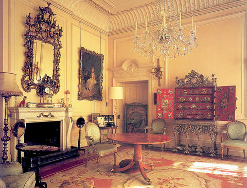
Another strong contender for the 'most beautiful room in England'. This time it's 'The Red Library' at Longleat. The portrait drawing on the easel is by John Singer Sargent.
There are no comments.
August 28, 2013
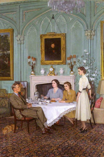
Herbert James Gunn (1893-1964) Conversation Piece at Royal Lodge, Windsor, 1950
Following yesterday's post, I thought it might be fun to have a quick look at Royal Lodge, the official 'country' residence of the late Queen Mother, and now the home of Prince Andrew, and if gossip is to be believed, Fergie. Of course, it's actually a stone's throw from London: some of you may know Windsor Great Park well. I've always loved the place, with it's wide open space, herds of deer, and blasted oaks; and its association with various fascinating myths and legends. The ghost of Herne the Hunter is supposed to roam the park, and over the years, various oaks have claimed the title of "Herne's Oak" (I think, regrettably, that the last one fell to the axe in 1906).

There's a terrific photograph of the Gothick drawing room in Derry Moore's The English Room, (published 1985), one of my all-time favourite books. As in Clarence House, the Queen Mother shows us that she had The Eye. It's hard to put your finger on, but it just has that 'something' about it, which for many people, is difficult to re-create.
Above the chimneypiece hangs an evocative portrait of the Prince Regent, which I assume is by Thomas Lawrence. Royal Lodge was the Prince Regent's favourite retreat.
Royal Lodge has been built, re-built, part-demolished, reconstructed, altered and re-furbished many times over the years. As Derry Moore says "although this house has only existed in its present form for a little more than fifty years, it has the atmosphere of age and a strange beauty that is essentially English".
If you're interested in discovering more, I've dug up a long out-of-print book by Helen Cathcart, published back in 1966. I've got no idea what it's like, but the front cover looks promising:

There are no comments.
August 27, 2013

Edward Halliday (1902-1984) Maundy Thursday, 1952
We were lucky enough to join a small tour of Clarence House, last week. The house is open to the public during the month of August. If you happen to be in London, I would urge you to go- there are only a few days left. Many, of course, will remember Clarence House as the official London residence of the late Queen Elizabeth, The Queen Mother. It's now the London house of TRH The Prince of Wales and the Duchess of Cornwall.
Clarence House was built between 1825 and 1827, for William, Duke of Clarence and his wife, Adelaide. Clarence was later crowned King William IV. The architect was John Nash. Nash, of course, is also known for the Brighton Pavilion, Regent's Park, the Garden Front of Buckingham Palace and Carlton House Terrace. If the exterior is all wedding-cake and stucco, the interior resembles a relaxed English Country House (albeit with antiques and paintings of the very highest quality; the Queen Mother had an excellent eye for Modern British painting), and has recently been renovated by Robert Kime in a successful and most sympathetic fashion. (Talking of Robert Kime, I've also just reviewed The Gunton Arms on my sister blog. This is a marvellously quirky inn, or pub- with rooms, and comes highly recommended).
It's probably going to be best if we go on our own tour, room by room:

The Entrance Hall

The Lancaster Room
A stunning room, despite its use as an unofficial 'waiting room'. Paintings include portraits of King Edward VIII, a series of watercolours by John Piper (more about those later) and a terrific Winterhalter (The Presentation of King Louis-Phillipe's Grandsons to Queen Victoria at the Château d'Eu). The chimneypiece originally came from a house in Dublin. The bronze on the table is a charming study of Winston Churchill and his wife, Clemmie, by Oscar Nemon.

The Morning Room

The Morning Room as re-arranged by Robert Kime (photograph taken from The World of Interiors)

The Morning Room (as rearranged by Robert Kime)
The Morning Room is currently on my 'top ten most beautiful rooms' list. Many of the Modern British paintings were collected by The Queen Mother. The painting of King George V in his racing bowler is by Walter Sickert (recently accused, in that silly book, of being Jack the Ripper), the bearded chap on the right (actually with his eyes closed) is George Bernard Shaw, as painted by Augustus John. The painting above the chimneypiece is A Lady in a Pink Ballgown, again by Sickert. To the left (and out of camera) hangs a charming Jamaican study, by none other than our old friend, Noel Coward. The alcoves contain the Queen Mother's collection of eighteenth century Cheslea porcelain. To modern eyes, this room seems timeless, but compare it with the photograph below:

Believe it or not, this is the very same room- but as it appeared at the end of the nineteenth century. The aesthetic taste on display is a very different beast from the current arrangement, which is very twentieth century- and mid-twentieth century, at that.

The Library
Another charming room. The Queen Mother knocked the Morning Room through, so that it opens up onto this room. Robert Kime reinstated the fabulous bookcases on either side of the door. The bookcase on the right holds the Queen Mother's favourite books, which included P. G. Wodehouse, Dick Francis, Alain-Fournier's Le Grande Meaulnes, and Siegfried Sassoon. At Christmas, the Duchess of Cornwall holds a party for disabled children in this room; a tall sergeant major from the Brigade of Guards helps them to decorate the tree.

HRH The Duchess of York (Elizabeth Bowes-Lyon) by Savey Sorine (1887-1953)
This portrait of the Queen Mother was painted in 1936, the same year as the Abdication Crisis. It hangs in the Library.

The Dining Room (photograph from The World of Interiors)
The portrait of the Queen Mother was painted by Augustus John. He was never happy with it, and it remains unfinished. The smaller painting to the left is a stunning watercolour by John Piper. During the Second World War, Kenneth Clark recommended that Windsor Castle should be painted- in a series of studies- by John Piper. There was a very real fear that, in the event of a German invasion, the castle could be destroyed. Piper's work is superb, and the castle is depicted against menacing and brooding English skies:


The Garden Room
It's a great photograph, but funnily enough, I found that this room was the least successful. The red japanned secretaire bureau is German, and belonged to Queen Mary, a terrific collector of antiques. The musical score on the piano (out of camera) is signed by Noel Coward.
The Smaller Drawing Room (as decorated by The Queen Mother)

The Duchess of Kent's Drawing Room

The Duchess of Kent's Sitting Room
Fitted carpets were all the rage.

The Russian Orthodox Chapel
Designed by C. B. Waller, this private chapel was installed on the first floor for the Russian born Duchess of Edinburgh. The Chapel was demolished in 1900.
Peak of Chic-
I loved Clarence House, charming atmosphere, and genuinely understated elegance- I hadn’t appreciated what a good Eye the Queen Mother had: Royal Lodge is also fascinating- but not open to the public. There’s a book about it I want to track down.
I prefer Robert Kime’s Morning Room, to the Queen Mother’s version (top photo). It’s all very subtle. I think he’s softened the wall colour (more grey), introduced some non-matching upholstery and slightly re-arranged it. Very subtle changes. Less is More. Reminds me of David Mlinaric’s approach.
What I like almost as much as the Morning Room is that glorious Edward Halliday painting.
The interiors are certainly very warm and comfortable, not to mention charming, too. Robert Kime is quite the master at decorating, isn’t he!
July 11, 2013

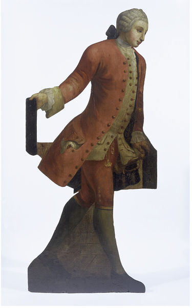
Early 18th century Dummy Board from Christopher Gibbs' The Manor House, Clifton Hampden, Oxfordshire, Christie's House Sale, 2000
If you enjoy visiting Country Houses, now and again you'll have probably come across the odd Dummy Board. "Dummy Boards" are flat, oil painted figures in trompe l'oeil- often life-sized (sometimes smaller), which were placed around the house: in halls, corridors, by fireplaces and on staircases. According to the Victoria & Albert Museum they originated in the early 17th century and were popular until the 19th century, when they fell out of fashion. "The figures were painted and shaped in outline to resemble figures of servants, soldiers, children and animals."
The edges of the boards were chamfered to increase the illusion. Reading up on dummy boards, I get the impression that today, we really don't have a full understanding of what they were used for. One theory is that they were an amusing form of practical joke. Another, which I think a bit silly, is that they were used as an early form of burglar alarm, to give the impression that a house was occupied when it wasn't. I'm taking that one with a pinch of salt. Getting inside the seventeenth or eighteenth century mind can be difficult. Sometimes, I think that in the modern age, we desperately need a 'reason' for anything or anything. I suspect that dummy boards were really no more than fashionable, whimsical diversions in an age very different to our own.
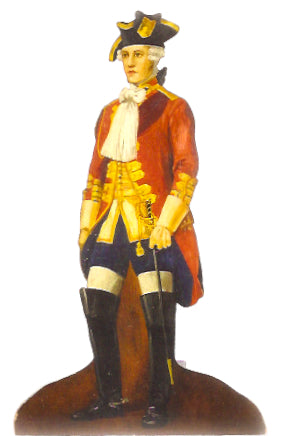
Dummy boards come up at auction from time to time, and I suspect that many of them are actually nineteenth century, or even later. I liked this splendid 'eighteenth century' chevalier (above) which came up for sale at Bonhams relatively recently. Very sensibly they catalogued it as Edwardian- which I am sure it is; it has a chocolate box quality about it, doesn't it? And I suspect that many so-called "dummy boards" are actually some form of shop sign. In the way that tobacconists used to place three-dimensonal figures of American Indians and Scottish footsoliders- in kilts- outside their shops.
If you're interested in finding out more, I've had a quick scout on the net, and sadly, there are hardly any books available on the subject. Claire Graham's Dummy Boards and Chimney Boards looks helpful, and Amoret and Christopher Scott's "Dummy Board Figures", first published in 1966, would be an essential addition to your antiques reference library- if you can find a copy.

Street Guitar Player, circa 1780 (V & A Museum, London)
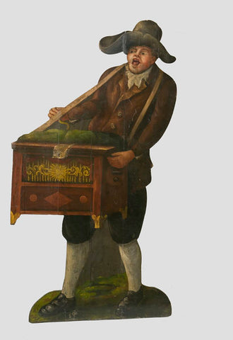
Street Barrel-Organist, circa 1780 (V & A Museum, London)
Eighteenth Century Gentleman (V & A Museum, London)

Greedy Pig Feeding From a Bowl, 1750-1800 (V & A Museum, London)
Hi—do you have a contact for Clare Graham? I’d love to get in contact with her. Thanks, Jonathan
Hi Sherry
Thanks for leaving a comment. Lucky you!
Drop me a line by email and I should be able to point you in the right direction,
Best wishes,
Luke
Hi….loved your dummy boards. I have a pair the V&A says are probably late 17th or early 18th century. A Dutch couple, they are 5’ tall and very beautiful….they look like something Vermeer would paint. I’d like your thoughts on how to sell them? Thank you very much. Shery in Texas
When I was lord of the manor, many years ago, I had dummy boards, also a lovely tall folly to impress my guests. Now I’m a ghost I have to while away the hours on the internet. Lucky Steve Jobs is here now, he gave me this ipad.
June 27, 2013
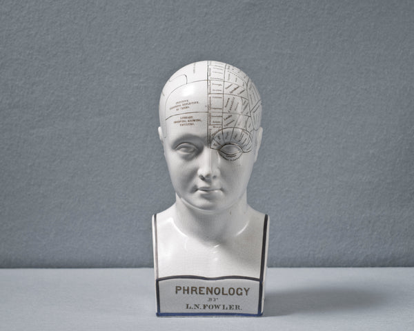
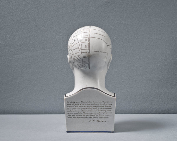
This splendid artifact has just arrived at the Honey Residence. It's an original antique Phrenologist's bust by the Victorian quack, Lorenzo Niles Fowler. Phrenologists believed that you could discover a person's true identity by feeling the bumps on his or her skull. If you look carefully at the bust you will see that the cranium is divided up into various sections which represent all manner of things: foresight, blandness, hope, integrity, dignity, self-love, friendship, independence; that sort of thing. Think of a virtue- or a fault, and I bet you it's there somewhere. Not that I want to denigrate the noble art (or science?) of phrenology. It's a lovely idea, and who knows, it might just, possibly, on a sunny day, be true. Up to a point Lord Copper.

These busts were desperately fashionable during the Swinging Sixties, and I seem to remember that David Hicks had one at his Oxfordshire house, Britwell. And they often graced the sets of television programmes such as The Avengers and The Prisoner. It was almost the case of "Let's Spot the Phrenologist's Head".
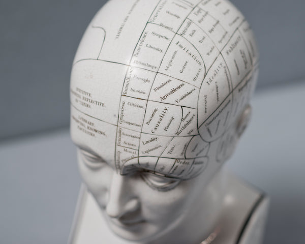
Don't confuse this head with all those reproductions out there, the ones that you can pick up in the market for a song. This head is the genuine thing, and relatively scarce at that, especially as it dates from the pre-1860's, when Lorenzo Fowler was working out of his publisher's office at no. 337, Strand, London. It's of a much better quality than the repros, too, with a finer detailing.
There are no comments.
June 25, 2013


There are no comments.
June 13, 2013

My clever friend, Alexandra Llewellyn, makes (and sells) beautiful backgammon boards. She often uses stylish Victorian graphics which are then digitally printed directly onto the wood. I like one of her latest designs ("Carnival"), based on old fairground or burlesque prints (as above).

Alexandra launched her business in 2010, and since then has been selling her boards to a select international clientele. You can also order a bespoke board from her as an individual commission, and the backgammon counters can be made up from a selection of decorative marbles, minerals and semi-precious stones. The reds, yellows and whites of her "Africa Table" (as below) work brilliantly, and are enormous fun. They remind me, in a way, of a 50's French pinball machine. You can watch Alexandra talking about her backgammon boards on this video.
You can also get in touch with Alexandra at: info@alexandralldesign.com

There are no comments.
May 31, 2013

To a rain soaked Glyndebourne yesterday to see a slightly 'iffy' production of Richard Strauss's Ariadne auf Naxos. Really wasn't sure about the second act which featured mental breakdown, sex addiction, maniac depression, straight-jackets, suicide attempts and enamelled hospital beds; but I did get another chance to inspect Henry Moore's magnificent Draped Reclining Woman, on permanant loan from The Tate Gallery. This is one of a series of six castings, made between 1957 and 1958.

There are no comments.
May 17, 2013

We're driving back to London from Oxfordshire one Sunday evening, and suddenly we're playing tic-tac with a dark blue Rolls-Royce Camargue. On the M40. There's an interesting looking blonde dolly-bird in the back, shielded by half-drawn sun curtains; propped up on silk cushons, reading The Sunday Telegraph, and her chauffeur looks like a swarthy Italian gigilo: unshaven, 80's sun-glasses, unbuttoned shirt.

The Camargue is one of those cars. Marmite Cars, I call them. You either love the design, or loathe it. Personally, I happen to like it. If there ever was going to be a Lady Penelope car, this one has to be it. The Camargue was first introduced in 1975; designed for Rolls-Royce by Pininfarina, with coachwork by the famous old firm of Mulliner Park Ward. In its day it was the most expensive car in the world. It was produced in a very limited edition. Only 530 cars were made.

In 2010 it was voted one of the "ten worst cars in the world" by the readers of the Canadian newspaper, The Globe and Mail. There's no accounting for taste, is there?
If the front is, perhaps, to the modern eye, a trifle clumsy, the side profile and rear is all sweeping elegance and svelte lines: this is a seriously grown-up machine. They're also still relatively affordable. But how long is that going to last? I'm currently saving up for one.
HH
It’s a splendid car. I admit to childish envy pangs as you glided past our tinny little Alfa. Certainly cut a dash in the salburious envions of High Wycombe- I think it was. Would love to hear about the car’s history. If you can bothered, please do take time to email me. I’m now intrigued.
Luke
The royal blue camargue is my car and that picture was taken in St emill ion in 2011. Very amused by the write up…very long story and amusing history with that car…I’m flattered by my m40 description…unfortunately I have to make a living in a rather more conventional manner…
Nice post making some interesting points …
Yes, that very dark blue- almost black- paint colour is terribly smart, isn’t it?
I think it’s one very good-looking car, but what I might like almost as much as the design itself is that sublime midnight blue metallic finish in the top photo.
Dolly-bird might be my new favorite word.
May 09, 2013

If you start thinking about the great design classics over history, which one immediately springs to mind? The Coca-Cola Bottle? The Paper-Clip? The Citroen 2CV? The Supermarine Spitfire? There's also another, lesser-known, one to add to the list. The Staunton Chess Set. The design was first patented on the 1st March 1849 by one Nathaniel Cook- for manufacture by the old firm of John Jaques of London (founded by Thomas Jaques in 1795). Jaques hit upon the brilliant idea of using the famous chess player, Howard Staunton, to endorse the new set; an early example of celebrity marketing, similar, say, in the way today that a famous television chef might lend his name to a range of saucepans.
The new design also simplified and stylised the chess men, making them more suitable for tournament play. Kings are topped with regal crowns, bishops have simple mitres, rooks are solid turrets which can be pushed decisively across a board (the chessmen just feel right in the hand). There's also a theory that the pawns were inspired by the Freemason's ball and compass. This may or may not be the case. But the knights are clearly inspired by the fashionable Neo-Classical Grecian styles of the nineteenth century, with the carved horse's heads of the knights showing a intriguing similarity to the beautiful Selene horses from the Elgin Marbles. The Elgin Marbles are fragments taken from the Athenian Parthenon, and first brought back to the British Museum in 1801 to 1812 by Thomas Bruce, the 7th Earl of Elgin. Selene is the Greek moon goddess; she drives a horse-drawn chariot across the Night Sky.

The proportions of the Jaques knight were to change here-and-there over the years (I often think that you can date Jaques chess sets along the lines of fine vintage clarets) but the basic horse head design remained more-or-less the same. The Staunton knights are just itching to jump across the board, and indeed they have been doing so since 1849. However, how many players are aware that they hold a little piece of Ancient Greece in their hands?
There are no comments.

Comments
There are no comments.
Post Comment